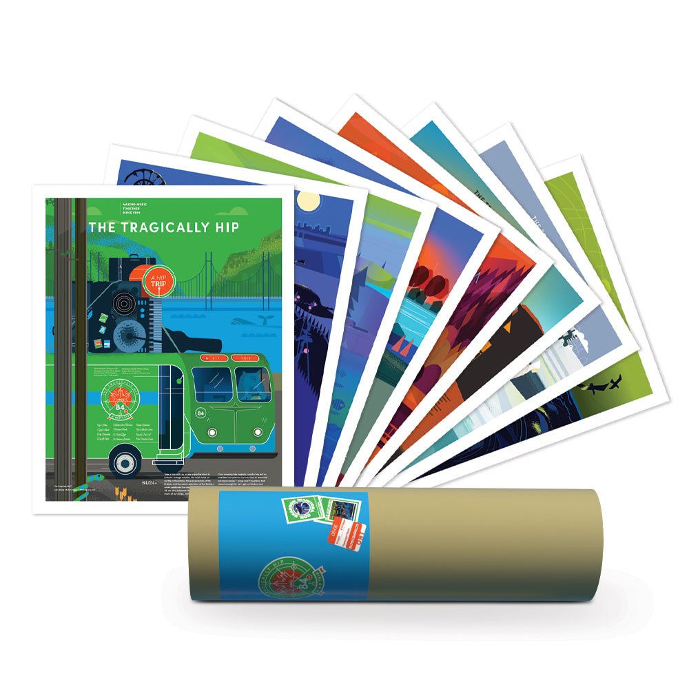


THE TRAGICALLY HIP A HIP TRIP poster set
THE TRAGICALLY HIP A HIP TRIP poster set
Couldn't load pickup availability
A set of 8, 16” x 20” posters designed and printed in Canada.
80lb Cougar Smooth uncoated paper.
Belisle and Rogers created the seven posters after a lot of back and forth balancing obvious songs with lesser known songs that have great stories behind them like The Dire Wolf poster representing Isle Aux Morts Newfoundland. Every poster presented challenges of showing the community, hinting at aspects of the songs in a subtle way that fans would recognize and discover, and then writing advertising copy that balanced the location, actual things to do in the community as a tourist and put them all together. The other aspect we wanted to look at was to give the posters a modern illustrative look and feel like a modern version of the travel posters from the past.
Intro poster:
The Hip Trip 40th anniversary logo and how to have the logo and locations on a poster without it being completely different than the other posters was a challenge. Using the same style we ended up with a vintage bus traveling to the locations, and added the logo and tour locations to the side of a bus, which worked with the format and brought it all together. Also a chance to bring in Gus the Polar bear as the driver.
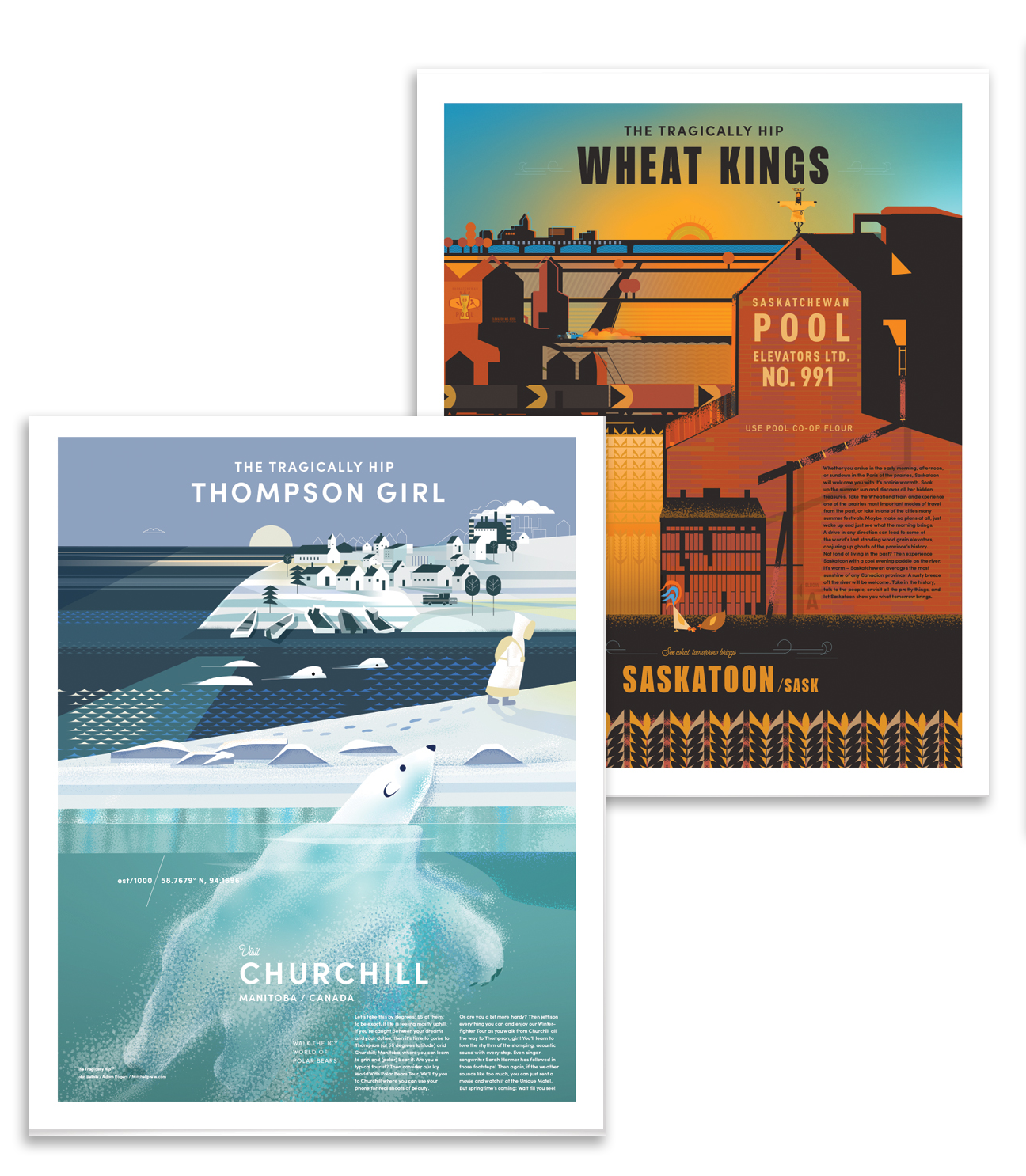
Thompson Girl/Churchill Man.
We started with this tried and true fan favourite. Even though it is “Thompson girl” what was visually appealing was based on this girl walking from Churchhill, and exploring what that landscape actually looks like, with Polar Bears watching and Nickel stacks in the background. Definitely wanted to recreate the grey-blue beauty that a lot of Canadians know from long winters.
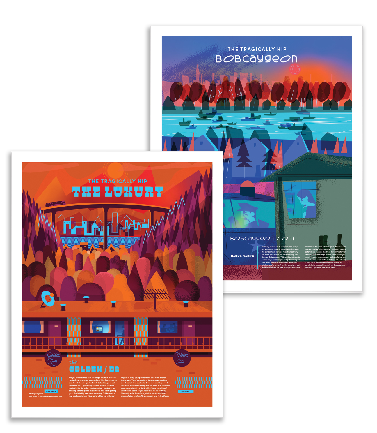
Bobcaygeon/Bobcaygeon Ont.
We knew this song had to be on there, the challenge was trying to understand what Bobcaygeon kind of looked like, and that a lot of people remember the video. We tried to create a color palette that went beyond a starry night that’s mentioned in the song. We zoned in on the waterway as an unique backdrop after lots of research and created the 2 characters in what was meant to be a goodbye in the early morning. Which why you see the wine bottles and Willie Nelson records on the floor of the house (very small).
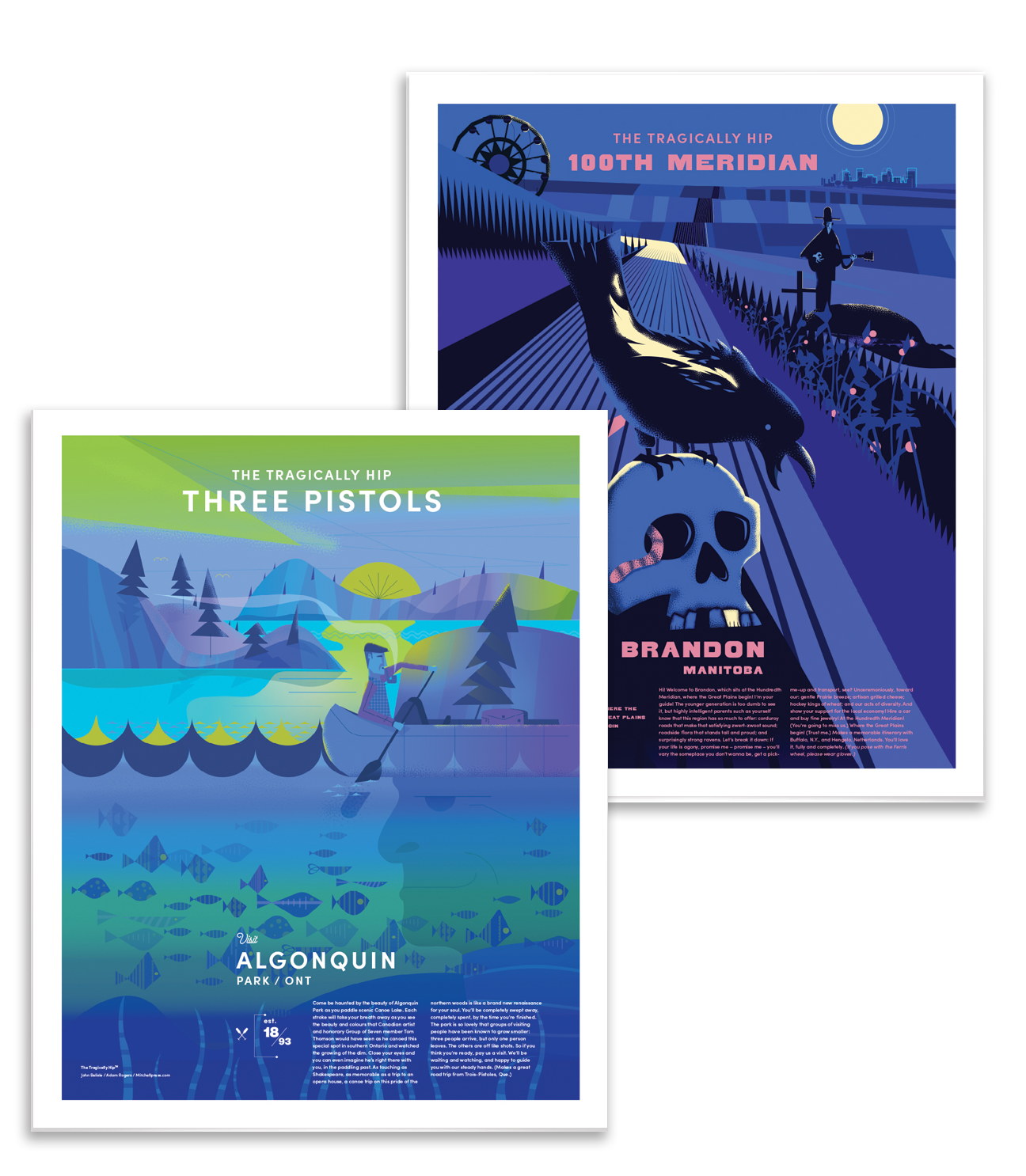
100th Meridian/ Brandon Man.
This was an interesting decision because it doesn’t actually mention Brandon and a few places can claim the 100th Meridian. But the people of Brandon know where it runs.
The poster itself has some of our favourite references starting with Ry Cooder singing a eulogy. The central image had to be based on the corduroy roads and how they continue into the distance. The Raven carrying a muddy old skull was a lyric that can be overlooked because of the quick phrasing, but it seemed like a great addition to the muddy road, patchwork fields and Brandon in the moonlight.
Three Pistols/Algonquin Park Ont.
Of all the posters we knew there was only one image that would work, Tommy Thompson paddling by, period. Like a lot of Canadians we are fans of the group of seven and the story of Tommy spending so much time there was a natural. We decided to try to capture the dimming light mentioned in the song and the landscape full of color. We intentionally added a bit of a Mid Century feel to the style for Tommy Thompson’s era and his painter’s fashion sense complete with pipe.
The Luxury/ Golden BC
The Golden Rim an actual Motel in Golden BC was mentioned in The Luxury when the band passed through and read the signs featuring soft water and color TV. For the poster we imagined the band holding over for a stay. Which of all the posters this is the only one that features the band in a small way. The TV inside the room featuring a lion. The lyrics in this song are so dense and touch on so many themes that we just had to pick the motel as a starting point. Then surround it with dense forested mountains and the bridge found just outside of Golden, using fall colors as a color guide. The poster copy also touches on the lyrics and the community.
Wheat Kings/ Saskatoon Sask
This was the first poster we thought of, then had second thoughts about the lyrics but the descriptions of the prairies was too good to turn down. Again we position the community, sunny Saskatoon in the background and bring the history of the grain elevators into the foreground. It was also a good place to attach the weather vane. We were inspired by the rusty brown elevators, wheat and warm light of the prairies for the color tones. A close look reveals other aspects of the song.
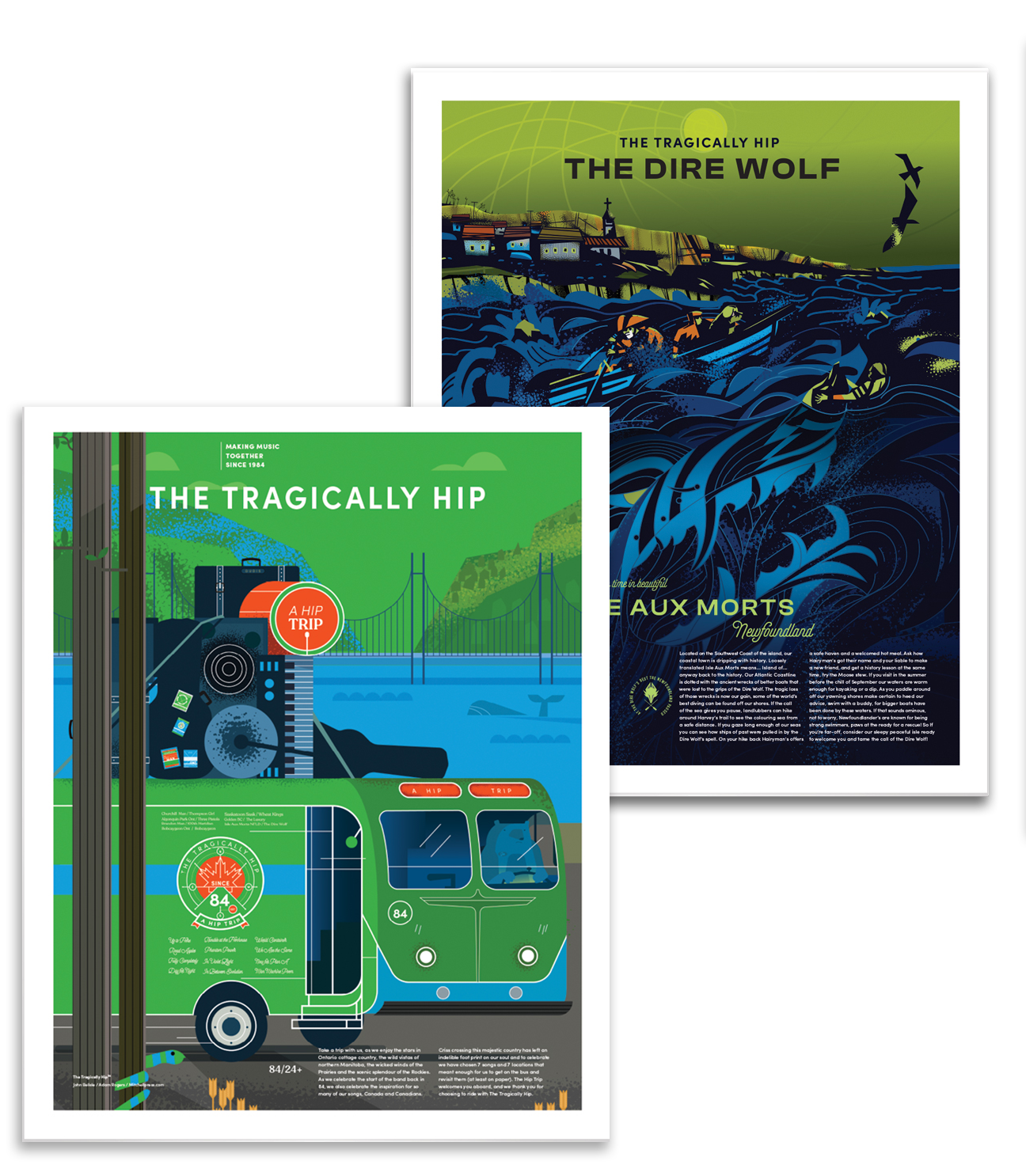
The Dire Wolf/ Isle Aux Morts, Newfoundland
This poster was another challenge to figure how many element we wanted to portray, ultimately the song references the growing sea and the history of ship wrecks off the coast. So we focussed on the stories of Ann Harvey’s family and their Newfoundland dog, Hairyman, who rescued almost 200 souls in two daring rescues in the early 1800’s.
About the artist:
Belisle Creative,
John Belisle is a designer/illustrator based in Vancouver BC. His work includes the Bid books for the 2010 Olympics, over 25 stamps for Canada Post, 50+ brand identities and campaigns for organizations in Canada and around the world
https://www.instagram.com/belisle_john
https://www.johnbelisledesigns.com
Adam Rogers
Adam graduated from OCA and illustrated in Toronto for several years before moving to Vancouver. He splits his time between teaching, illustrating and spending time with his family. His work has been featured in the Society of illustrators awards annual, Communication arts and Applied Arts.